Dec 092021
This page is a repository for my experiments in machine learning, creative AI, and computer graphics in the service of making art. Don't expect quality. These are tests that have been somewhat successful (or at least failed interestingly), with occasional exposition, but often I'm just dumping sketches up here.
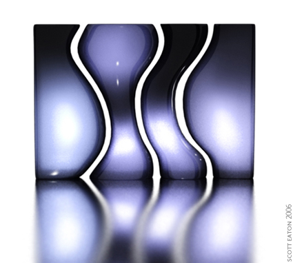
Daily experiment – what happens when you mix bodies with hands (not mine) and add the magic of neural networks? We didn’t know, until now.
Joking aside – the magic of this emerging artistic medium (using AI, machine learning, deep neural networks, whatever you want to call it) is the ability it gives us to remix domains, effectively combining visual ingredients into a cauldron, the way a chef experiments in the kitchen, to see what happens. The results are sometimes good, sometimes awful, but there is adventure to be had. It is a new type of visual exploration, and gives us new components for our creative processes.
Experiments coming frequently until the June 18th exhibition.
Copyright © Pixar Animation Studios
This sketch was developed for Pixar’s RenderMan Univeristy and demonstrates using procedural displacement mapping to achieve an interesting visual effect. The setup, covered in fine detail in the Courseware, uses on a particles system that writes primitive variables (primvars) onto the table top each time there is a collision event. The table top has a custom displacement shader that uses these privars to locate the ripples both spatially and temporally. From there, the rest of the displacement shader handles the pattern generation for the concentric rings. A movie of just the ripple pattern is shown below. This was output as an AOV (arbitrary output variable), a framebuffer separate from the final render, and was subsequently used to composite the final result.
Copyright © Pixar Animation Studios
Copyright © Scott Eaton
This sequence shows the use of corrective displacement mapping to achieve high resolution facial expression on top of a low-resolution animation mesh. The character on the left is rendered with his standard displacement map (sculpted in Zbrush) as well as a number of per-expression corrective maps, also sculpted in Zbrush. The same character on the right is rendered without the base displacement and shows only the corrective displacement mapping.
The entire pipeline for creating and rigging the facial setup was the topic of my Alias 3December workshop in 2005, titled appropriately “Corrective Displacement Maps for Facial Expressions”. Even though it is old, you can download the slides from the presentation here.

Here are a couple experiments put together for Pixar’s RenderMan University which demonstrate programmable raytracing in RenderMan.
The is an example of using the gather() construct in an unusual fashion to create an interesting visual effect. The gather() call fires a hemisphere of rays above each shading point on the ground plane, and instead of tracing the usual diffuse or specular reflections (what raytracing is most often used for), the rays return their length (i.e. the distance to) each hit object, in this case the spheres. From there it is a simple case of normalizing the average distance and mapping it into a colored ramp.
This example is a visualization of ray depth. Each ray is traced into the scene and is reflected/refracted a number of times before it terminates on the bouncing sphere. The “camera” ray is always at trace depth 0, this is when the sphere is in plain view to the camera. As it falls behind the transparent screen the trace depth increases by one. Reflections off the floor and through the screen increase the depth a step further.
Copyright © Pixar Animation Studios
Here is another video I developed for Pixar’s RenderMan University, this one demonstrates an interesting techniques that can be achieved with a fairly simple custom displacement shader that relies mostly on an understanding of the fundamentals of computer graphics. Specifically, the technique uses a sequence of depth maps (shadow maps) rendered from beneath the surface capturing the distance from the shadow camera to each point on the displacement-mapped spheres. Each point can then be transformed into world space and used as an exact displacement amount for an object pressing into a surface. The effect of using a single depth map for displacement is show below:
Copyright © Pixar Animation Studios
And of course, to achieve persistence, you need to accumulate the depth maps per-frame and use the running total to displacement the current frame. The Courseware goes into detail about this process showing how to do this by either writing an external Python script or using It and Iceman, RenderMan Studio’s internal compositor and scripting language.
Copyright © Pixar Animation Studios
Copyright © Pixar Animation Studios
Here is a small project I created for Pixar’s RenderMan University that visualizes internet connectivity across the world. It was were created using Python and Pixar’s RenderMan software. RenderMan University includes a comprehensive “making of” tutorial walking through all the steps involved in creating and rendering this animation.
Technically the project demonstrates the use of procedural primitives in RenderMan, meaning geometry (in this case curves) that are generated dynamically at rendertime by an external program. The “external program” in this case is a Python app that I wrote to parse a number of publicly available datasets to extract node-to-node connectivity of the internet backbone autonomous systems (AS). A second dataset maps these AS numbers to latitude and longitude coordinates. The final step is to take the resulting data and use it to generate RenderMan RiCurves.
To control the appearance and incandescence of the curves over time I wrote a custom surface shader that reads a “start time” primitive variable off each curve and ramps opacity along the length of the curve during creation. Once created the shader fades off the incandescence to give a subtle cooling effect (all this is viewed better in the original HD).
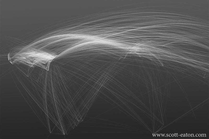
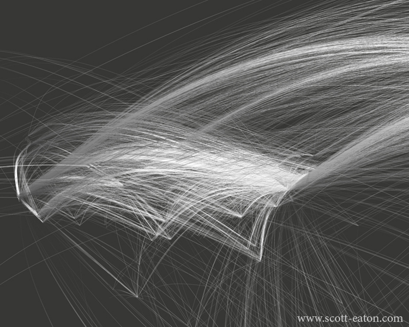
The top image shows the western hemisphere, notice the volumes of connectivity from the US to Europe and on to Asia (off the map to the right). Also interesting is the relative lack of internet infrastructure in South America and Africa. The bottom image is a closeup of the US, notice the huge number of links from the mid-Atlantic coast. This is where a number of large internet companies keep their data centers, just outside of Dulles in northern Virginia.