Copyright © Pixar Animation Studios
Here is a small project I created for Pixar’s RenderMan University that visualizes internet connectivity across the world. It was were created using Python and Pixar’s RenderMan software. RenderMan University includes a comprehensive “making of” tutorial walking through all the steps involved in creating and rendering this animation.
Technically the project demonstrates the use of procedural primitives in RenderMan, meaning geometry (in this case curves) that are generated dynamically at rendertime by an external program. The “external program” in this case is a Python app that I wrote to parse a number of publicly available datasets to extract node-to-node connectivity of the internet backbone autonomous systems (AS). A second dataset maps these AS numbers to latitude and longitude coordinates. The final step is to take the resulting data and use it to generate RenderMan RiCurves.
To control the appearance and incandescence of the curves over time I wrote a custom surface shader that reads a “start time” primitive variable off each curve and ramps opacity along the length of the curve during creation. Once created the shader fades off the incandescence to give a subtle cooling effect (all this is viewed better in the original HD).
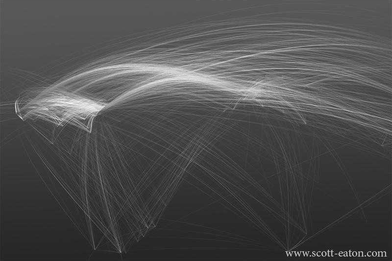
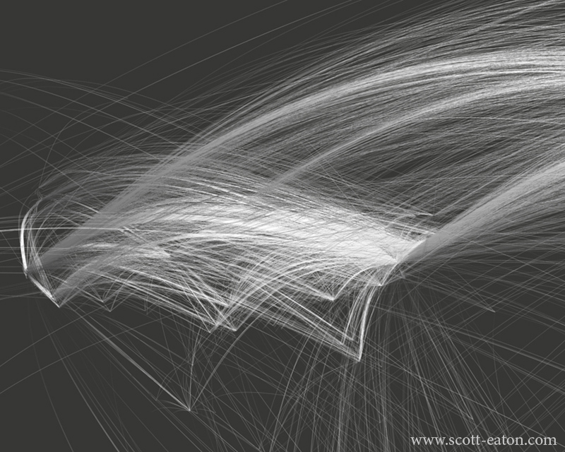
The top image shows the western hemisphere, notice the volumes of connectivity from the US to Europe and on to Asia (off the map to the right). Also interesting is the relative lack of internet infrastructure in South America and Africa. The bottom image is a closeup of the US, notice the huge number of links from the mid-Atlantic coast. This is where a number of large internet companies keep their data centers, just outside of Dulles in northern Virginia.